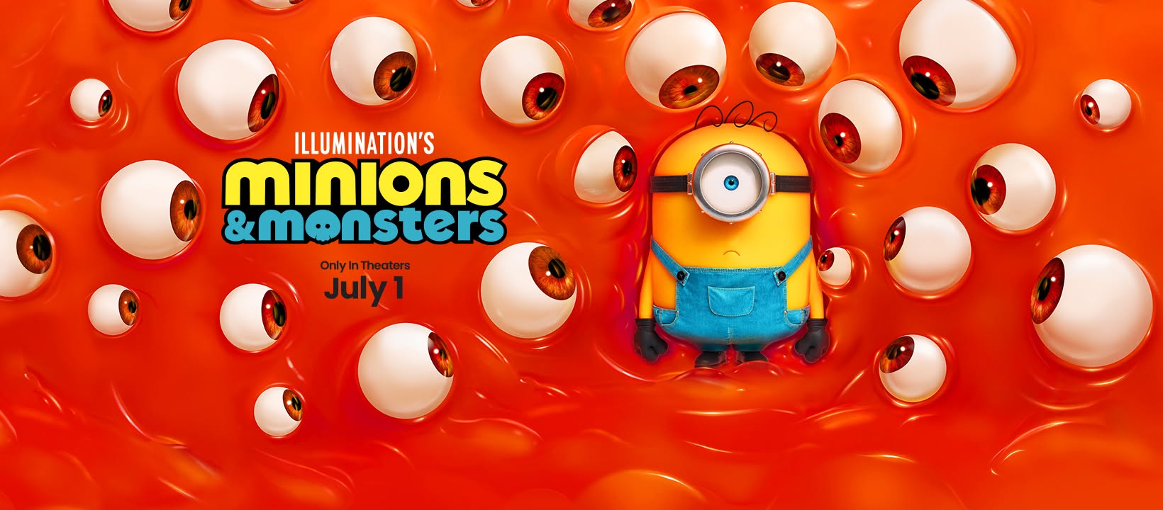
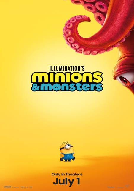
Minions & Monsters
Minions & Monsters returns audiences to the wildly popular world of Illumination�s Despicable Me universe, bringing everyone�s favourite mischievous yellow henchmen back for another chaotic adventure. Since their debut in 2010�s Despicable Me, the Minions have become one of the most recognisable animated characters in...
Learn More
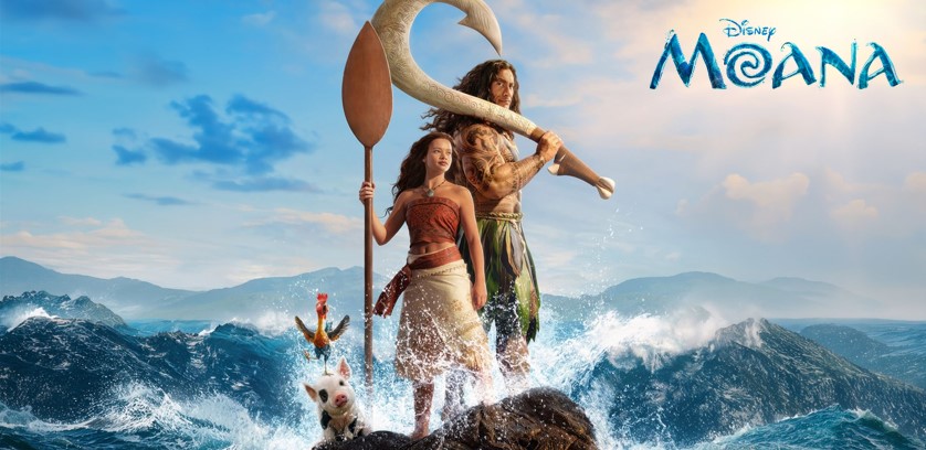
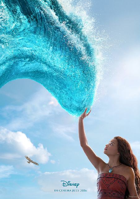
Moana
In Disney�s live-action reimagining of the beloved Oscar�-nominated animated adventure, Moana (Catherine Lagaʻaia) answers the Ocean�s call and, for the first time, voyages beyond the reef of her island of Motunui with the infamous demigod Maui (Dwayne Johnson) on an unforgettable journey to restore prosperity...
Learn More
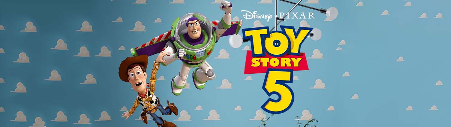
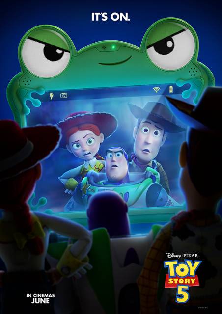
Toy Story 5
The toys are back in Disney and Pixar's "Toy Story 5," and this time it's Toy meets Tech. Woody (voice of Tom Hanks), Buzz Lightyear (voice of Tim Allen), Jessie (voice of Joan Cusack) and the rest of the gang's jobs are challenged when they...
Learn More


.jpg)
